Thursday 25 April 2013

Evaluation: In What Ways Does Your Media Product Use, Develop or Challenge Forms and Conventions of Real Media Products?

In this presentation, I have spoken about how I have used the expected conventions of my magazine.


A COMPARISON OF MY MEDIA PRODUCT TO A SIMILAR MEDIA PRODUCT


Here is a visual comparison of both my front cover and an actual professional music magazine front cover that is on the market. You can see the similarities in conventions used, but you can also see the differences in other conventions that have been added in order to sell to the product to the audience. Similar conventions include the plugs, the distorted look of the mastheads and the USP (Unique Selling Point) of the magazine being one of the main focuses of the cover. Differences in the use of conventions however include the use of cover lines on my cover. Kerrang don't seem to have any noticeable, and this could count as disadvantage because the reader may not want to waste there time looking on the contents page for specific things they hope is included in the issue. Also, I have placed my main image in front of the masthead slightly as opposed to what Kerrang has done. This is so that it looks like a better use of ICT/Photoshop has been used. This may also up my advantage because the reader will take my magazine more seriously in terms of quality. One more difference includes the fact that my front cover is less crowded in comparison to the Kerrang cover. I did this purposefully, and this shows I have thought about my layout carefully - maybe even more so than Kerrang has. The fact that I have more space on my mine makes the front cover look sophisticated, and less cluttered if once again comparing to Kerrang. The reader won't feel they have too many things at once to look at, and will comprehend quickly what the magazine is about.

CHALLENGING CONVENTIONS

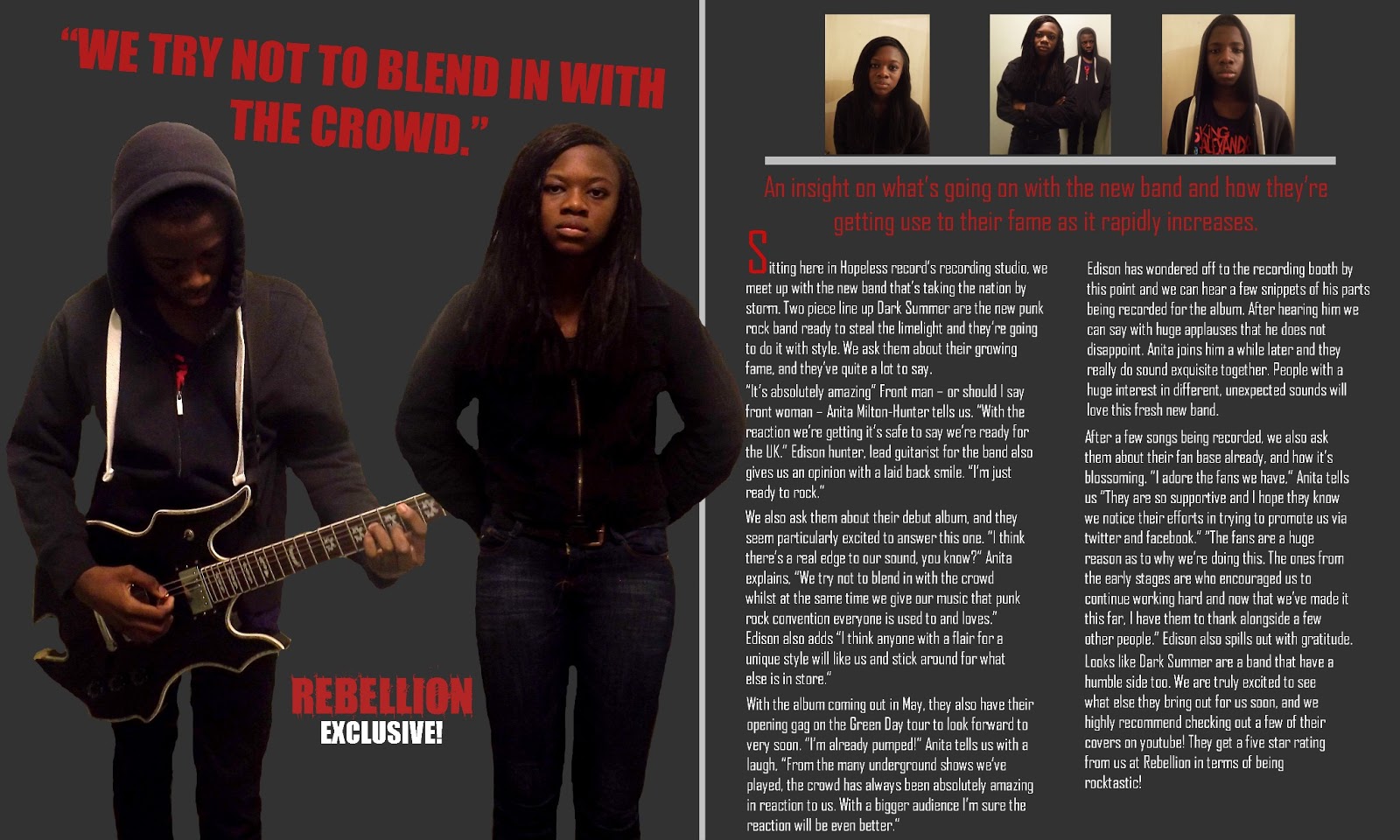
I think the one way my magazine has challenged conventions, is going against the stereotypes of what race is expected to like what type of music. I have got two people in as my main image on the front of my cover, but their ethnicity subverts the expected conventions. Stereotypically, people would say that a black people don't really listen to rock music, and would prefer rap, hip-hop etc.  My magazine challenges this stereotype  and I think I have done this well. My target audience may see this as an interesting addition to my magazine, as it is something that might capture their attention for being slightly unique.

Saturday 20 April 2013

Evaluation: What Have You Learnt About Technologies in the Process of Constructing This Product?


“In terms of research, I have used a range of Microsoft office softwares to record down analysis for rock magazine front covers, contents pages and double page spreads. So things like powerpoint, publisher, word, etc.

I used these softwares because they all had interesting ways of displaying my research nicely and they generally were all very simple to use. And Also I think I’ve developed better analysis skills and these softwares contribute to that greatly. By being able to access them easily, I was also able to consistently use them and get used to the flow of analysing.

Moving on to Planning, the one main use of technology I used was a camera. The obvious use for this was so I could take the pictures needed for the front cover, contents page and double page spread. The camera has been useful in the obvious fact that it was only way I would be able to create images for the content of the magazine. I’ve also been able to develop my photography skills: thinking more about angles, shot types and such.

For the production, I relied greatly on photoshop. I used photoshop to manipulate the images to how I wanted them to look and so in the end I was able to create all the aspects of my project. Photoshop has most definitely been useful. I was able to create what feel are strong finished results, and all because of the tools that are available on the software.

Lastly, for my evaluation I have used a variety of technologies. The main one I feel is a video recorder. I used the video recorder to create an interesting answer to a few of my evaluation questions, and so that they weren’t just plain text on a page. In terms of creativity, I definitely think the videorecorder has been helpful.
And to conclude, I think that If I was to make another magazine I would use more softwares like fireworks and gimp. I would also use more physical technologies like higher tech cameras, so that have the best quality pictures.”

Friday 19 April 2013

Evaluation: Looking back at your preliminary task, what do you feel you have learnt in the progression from it to the full product?

Evaluation: How Did You Attract/Address Your Audience?


Interviewer: Hey guys! Welcome back to the show. Today we have a VERY special guest. She's just launched the first issue of her new magazine and it's a gaurenteed success. She's abroad at the moment but we managed to get her on the line. Give it up for Natasha!

Interviewer: So Natasha, thanks so much for coming on the show.

Natasha: Oh it was no problem at all Natasha.

Interviewer: We've got quite a few questions to ask you.

Natasha: I'm sure I'll be able to answer them.

Interviewer: Firstly, How did you find out what would appeal to your target audience?

Natasha: Well, it wasn't easy. I first had to do some in depth research on what my target audience like. My target audience so happens to be people between the ages of 14 - 18 that listen to rock music. To find out such information I did some analysis on a few big name rock magazines like Kerrang and NME so that I could help myself understand what made people like these magazine's so much. I also did questionnaires, and asked them a few questions about their ideal rock magaazine.

Interviewer: Wow Interesting. The next question: What did you find out?

Natasha: I found out that many people liked the name 'Rebellion' for a magazine because it represented 'rock' music best to them in a way that would convince them to buy the magazine. I also found out that my target audience would prefer new bands on the front cover to promote the magazine, because they're always looking for new bands to listen too. Another interesting thing I found out was that if the colour scheme of the magazine didn't have any colours like black and red they wouldn't consider it a rock magazine. These colours connote dark themes and danger - things that are usually asociatted with rock.

Interviewer. How great. We just so happen to have a picture of your magazine front cover here. Care to talk us through it while we put it up on the screen? How did use the information you found out?

Natasha: Well as you can see, I made sure to go along with the masthead name 'Rebellion'. I think the typography gives off a rock genre vibe. I also managed to get the new band dark summer to appear at the front, and I made sure they were wearing dark clothing and expresionless faces. I also stuck to a colour scheme of red and black, as I've mentioned before the main colours that connote things to do with the rock genre.

Interviewer: It really does look amazing. Last question: Do you think your magazine has been successful in addressing your target audience?

Natasha: Yes. I've stuck to the stereotypical conventions of a rock magazine and it seems to have worked just fine. My contents page and double page spread contribute to this greatly also. Mainly through the use of the pictures of the typography.

Interviewer: Ah yes, we also have copies of those as well.

Interviewer: Well thats it. Thank you for talking to us today Natasha.

Natasha: Thank you for having me Natasha.

Interviewer: Until the next show, its goodbye from us!

Evaluation: Who Would Be The Audience For Your Media Product?

Evaluation: What Kind of Media Institution Might Distribute Your Media Product and Why?

Tuesday 5 February 2013

Planning: The Photoshoots

I have taken a variety of photos for this project in a number of different locations. Later, I will decide which ones are the best and which ones will appear in the magazine.